Rescaling graphs in the MicroSolv HPLC PQ Kit Excel template - Tips & Suggestions
December 8, 2021
/
/
/
/
/
/
Steps to manually re-scale the Y-axis in the PQ Kit template
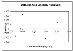
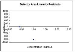
Note, Residual graphs are not automatically set to scale of the data entered. As such, the Y-axis default settings may be out of ratio for the data values entered. By manually re-scaling the Y-axis, it will reflect your values for a more effective visual ratio.
Please use the following instructions to format and scale the Y-axis of graphs in the MicroSolv HPLC PQ Kit Excel template :
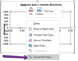
- In the detector linearity tab of the PQ RID spreadsheet, right click on the detector linearity residual graph.
---
- This will open a tab of options. Click "Format Plot Area."
---
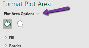
- This opens a new grey tab to the right of the screen, labeled, "Format Plot Area." Click the blue arrow next to the "Plot Area Options."
--
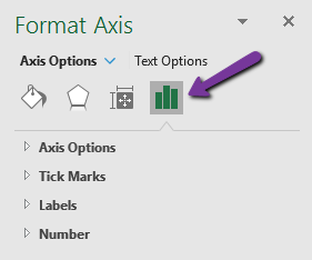
- Next, click the 'Graph' icon.
--
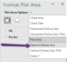
- This will open a list under “Plot Area Options.” click the "Vertical (Value) Axis" option.
---
- This will open a tab to “Axis Options.” Then Check “Reset” on both the Minimum and Maximum Bounds.
---
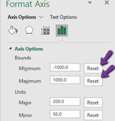
- Then check “Reset” on both the Major and Minor Units.
---
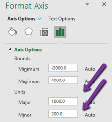
- Your new graph should now be to scale and display all data points.
---